Recent Client Redesign Project
Hello and welcome to the blog!! Today I am sharing my latest client redesign project. This was a really fun project with a great client! For this project we only focused on furnishings and styling. The paint colors and bones of the house were already great so my client just wanted help finishing off the house as far as design went and make it feel complete. So that is what I helped with! You all know I love to shop and hunt for deals so this was a dream for me!
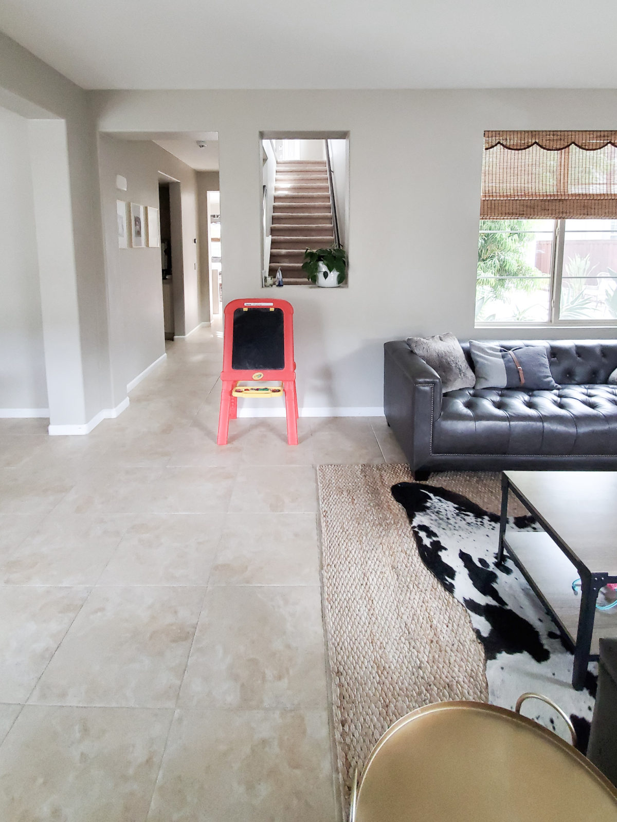
Lets start with the entry of the home. So the before of this space wasn’t bad at all. My client wanted some sort of “moment” right when you entered the home. Paint color is Revere Pewter Benjamin Moore. Source for bamboo shades is unknown.
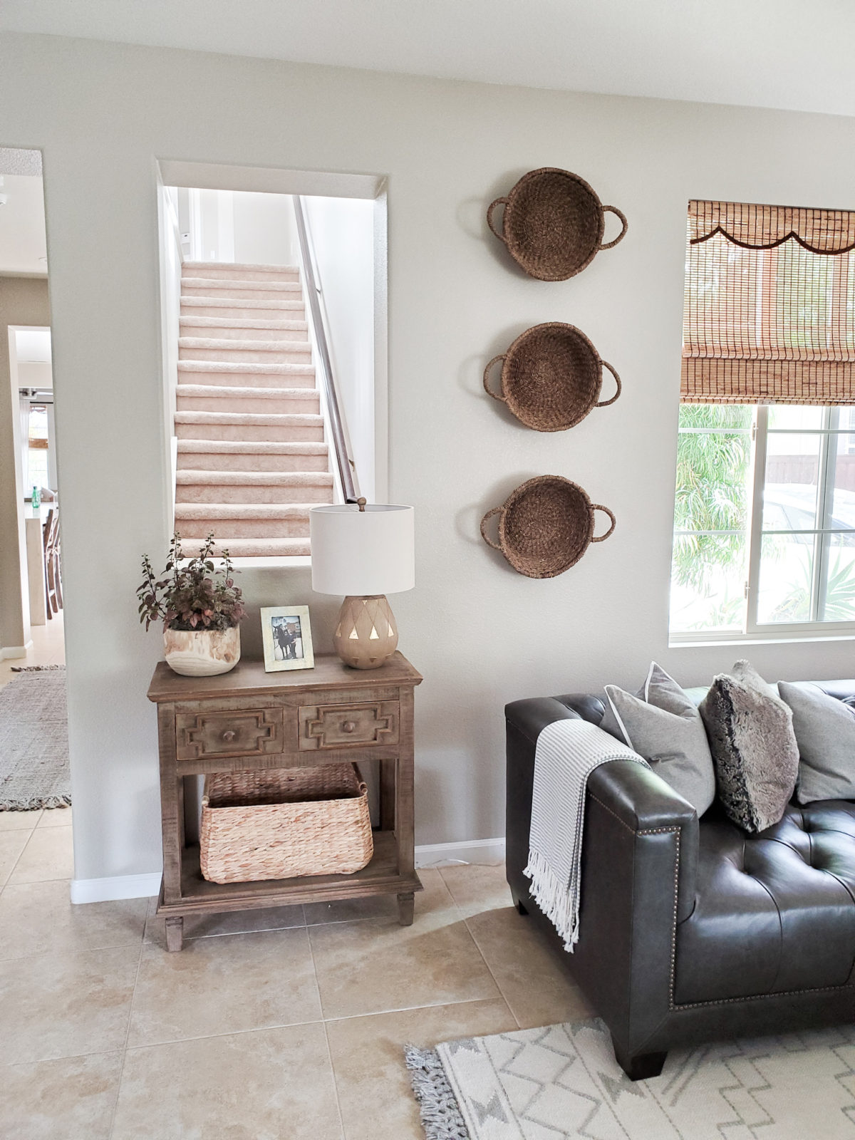
In order to make the space that you see right when you walk in the home feel more complete, I added this great little console I found at Homegoods. I topped it with a table lamp also from Homegoods and a plant and picture frame my client already had. I also added a basket from Homegoods for extra storage. I hung three baskets from Ikea on the wall and voila you have a more welcoming space! I love adding lamps to any entry area. I just feel it warms the space up and makes it feel more cozy, and you can flip on a light when you walk in the door! Throw blanket similar console table
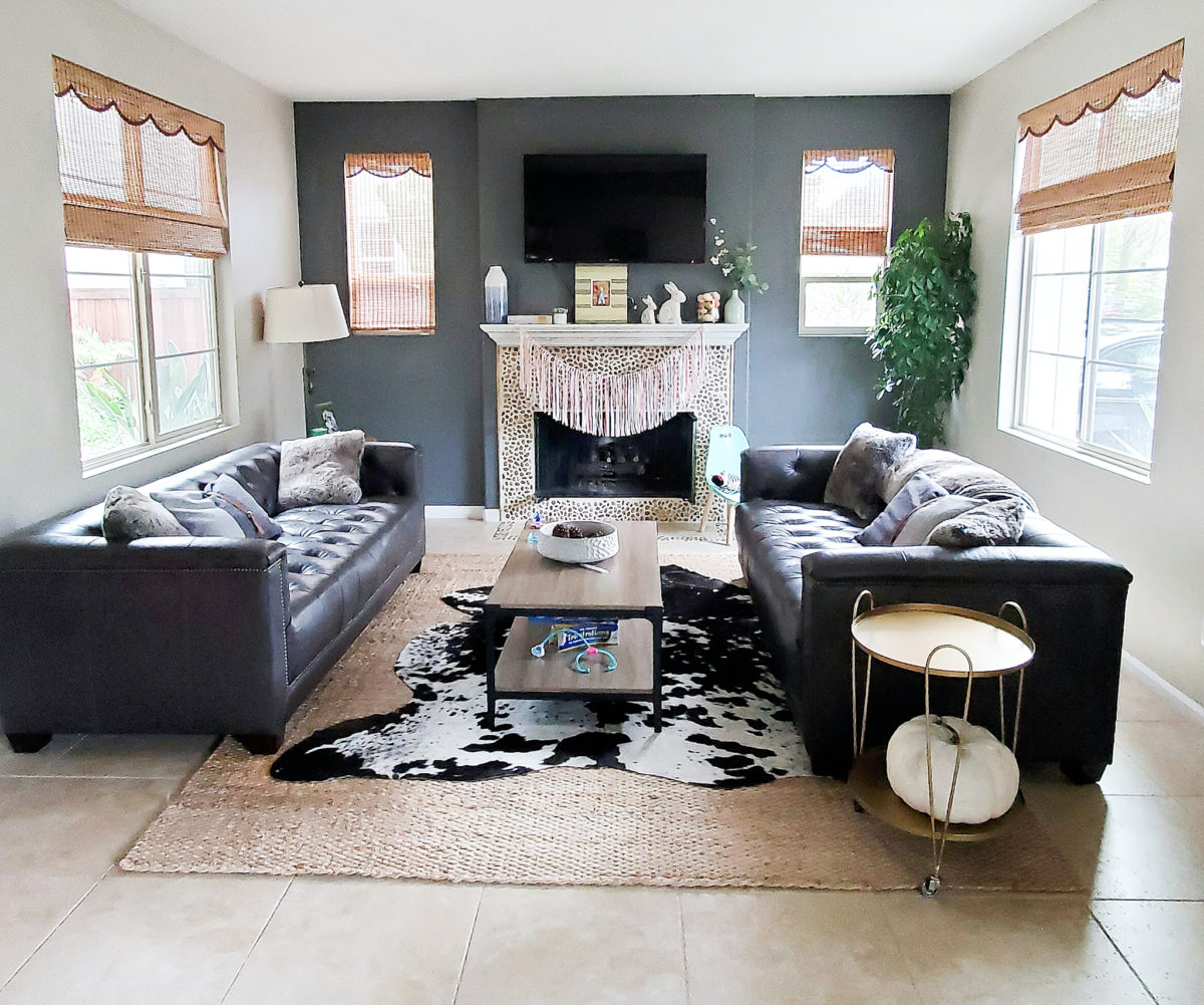
To the right of the entrance is the front formal living room. My client already had so many good things happening in this space. It just needed a few extra touches. Accent wall color is unknown it was already painted when my client purchased the home.
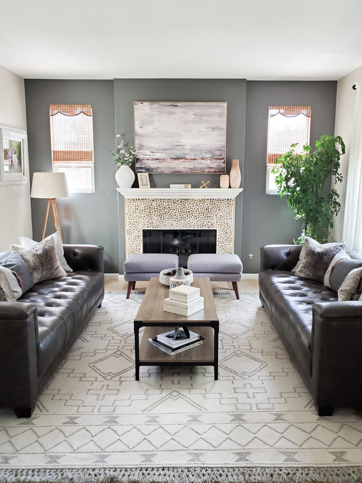
The first thing I added was this fabulous Ivory Aztec Rug from Rugs USA. I absolutely love it!! I was very impressed with the detail and quality when I laid it out. I felt like the soft white and gray complimented the space better than the cow hide and jute. This more calm muted rug allows the sofas and fireplace to be the stars of the space. It’s crazy what a different rug can do a space! Coffee table, similar sofa, decorative boxes, similar artwork
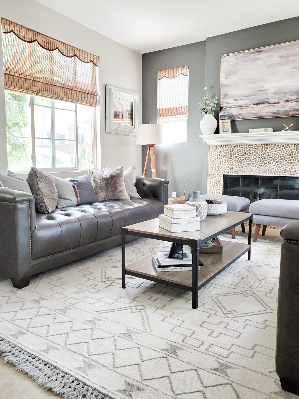
I still can’t get over how this rug from Rugs USA transformed the space!! It just brightens it up and made everything coordinate so much better. I also added a new floor lamp from Target, and two gray ottomans for additional seating. My client decided to remove the television from this space and I put a beautiful canvas piece I found at Homegoods in its place. I styled the coffee table with found items from Homegoods as well. Fur pillows
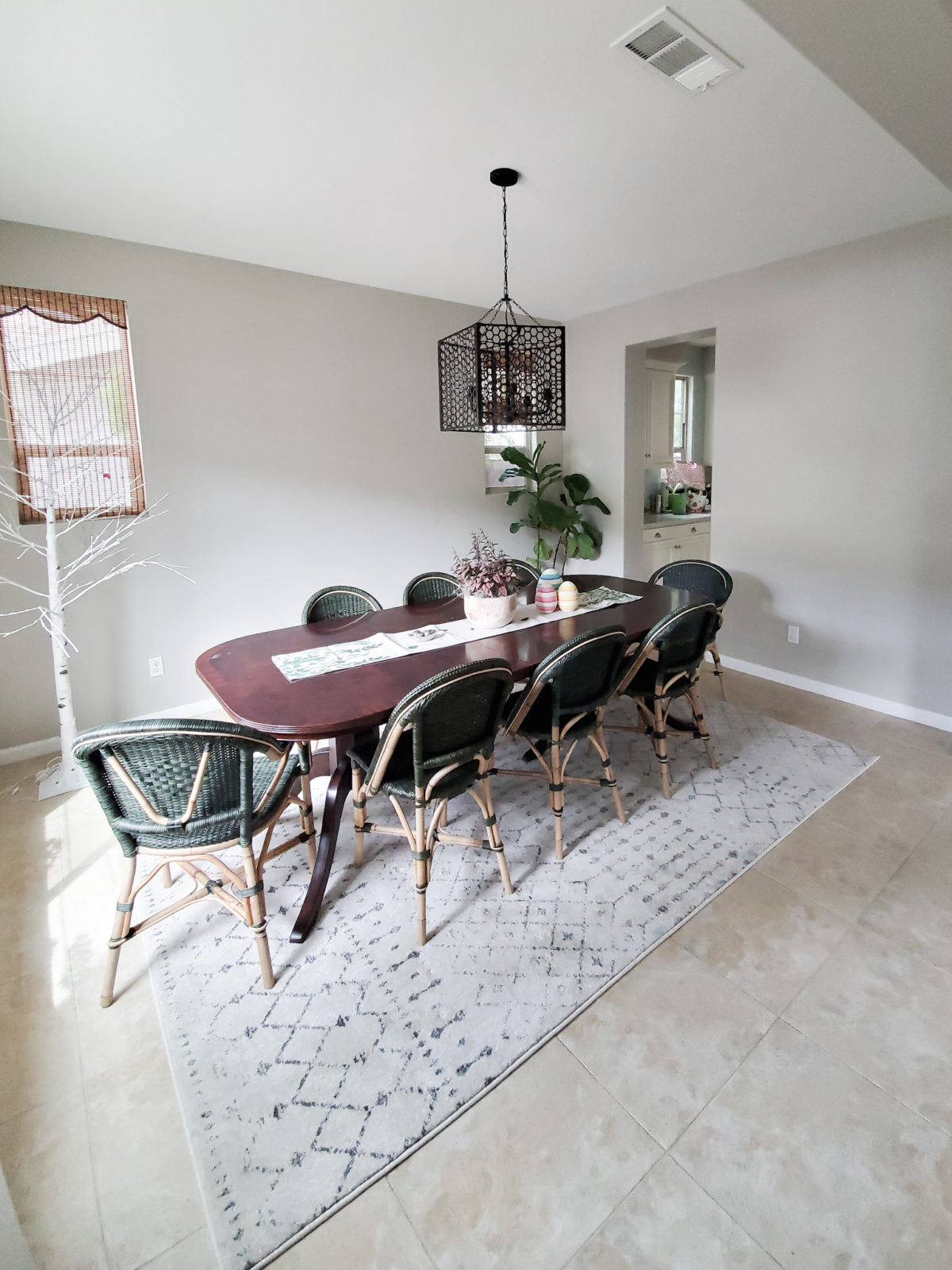
Directly across from the formal living room is the dining room. My client had recently added these beautiful Serena and Lily dining chairs. I just love the dark green color, but unfortunately they did not work with their current dining table.The rug that was in the space was good, but I felt it just didn’t work with the space.
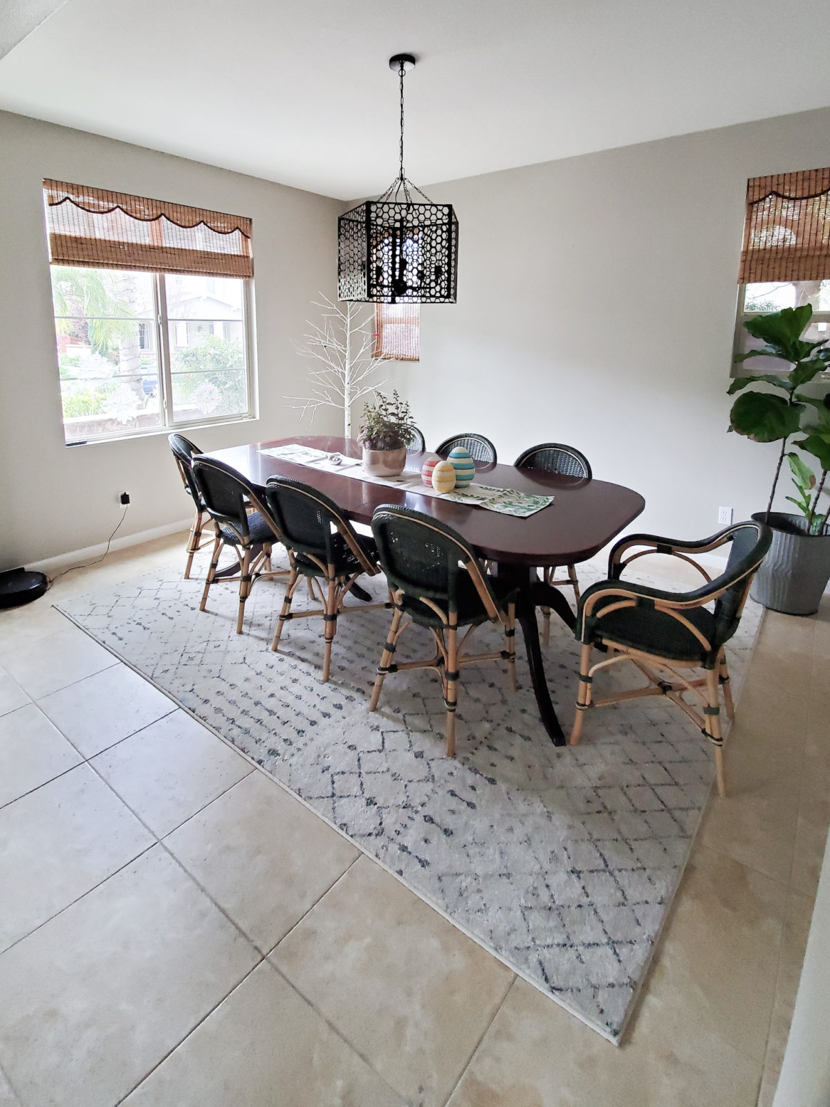
The chandelier was great for the space so I knew we should keep that. The chandelier was from World Market but unfortunately they no longer make it. Here is a similar chandelier. I felt and so did my client that the space needed some artwork and more storage. Metal planter
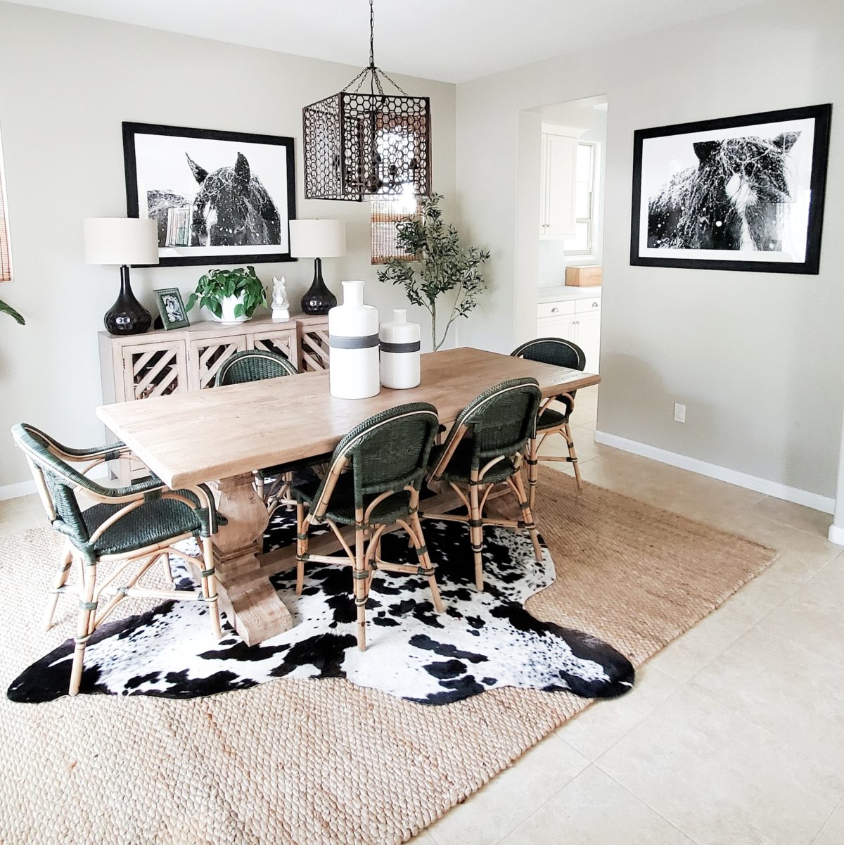
My client loves horses so immediately Minted popped into my head!! I knew these amazing horse prints would be the statement pieces this space needed. I absolutely love these horse prints, and have them in my home as well! I honestly feel they are the best horse prints around and Minted’s quality is unbeatable. Not to mention their selection. Whenever I need to look for wall art for myself or a client, I always go to Minted first! Paint color Revere Pewter Benjamin Moore
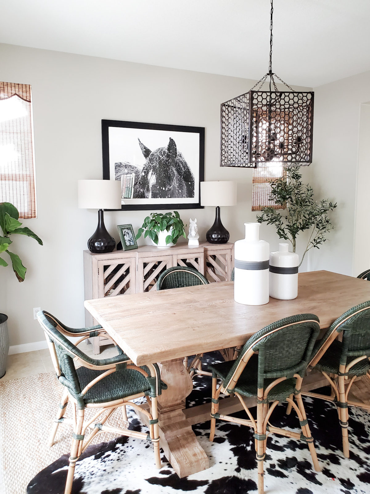
I knew the Minted Horse Prints were going to look good in the space, but I was blown away by how good they looked! I moved the jute and cowhide that was previously in the formal living room into the dining room. I wanted to bring in the natural tones of the jute to go with the natural wood on the chairs, and the black and white from the cow hide to tie in the horse prints. My client sold the previous dining table and we replaced it with this gorgeous natural wood dining table. I love the large pedestal legs on it, and let me tell you this table is solid and well made! It goes perfectly with the existing dining chairs.
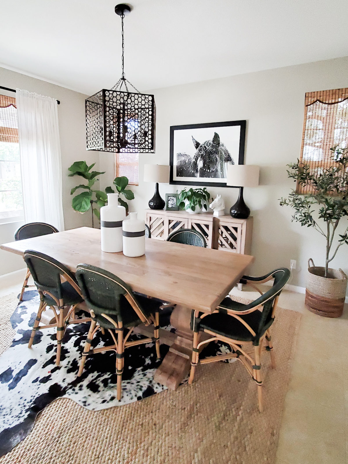
I topped the dining tables with some white and black vases from Crate and Barrel. I also added a faux olive tree in one corner. My client already had a fiddle leaf fig in the space but I think the olive tree compliments it nicely. We also added a new Credenza to space to act as a buffet and provide extra storage. It went well with the new dining table.
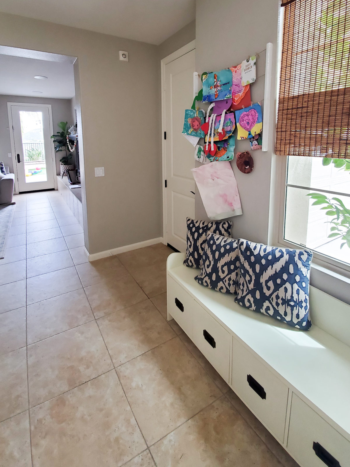
There is this great area right off the garage door. My client already had this great storage bench to store shoes. I knew I could make it a little more functional and look a bit more finished.
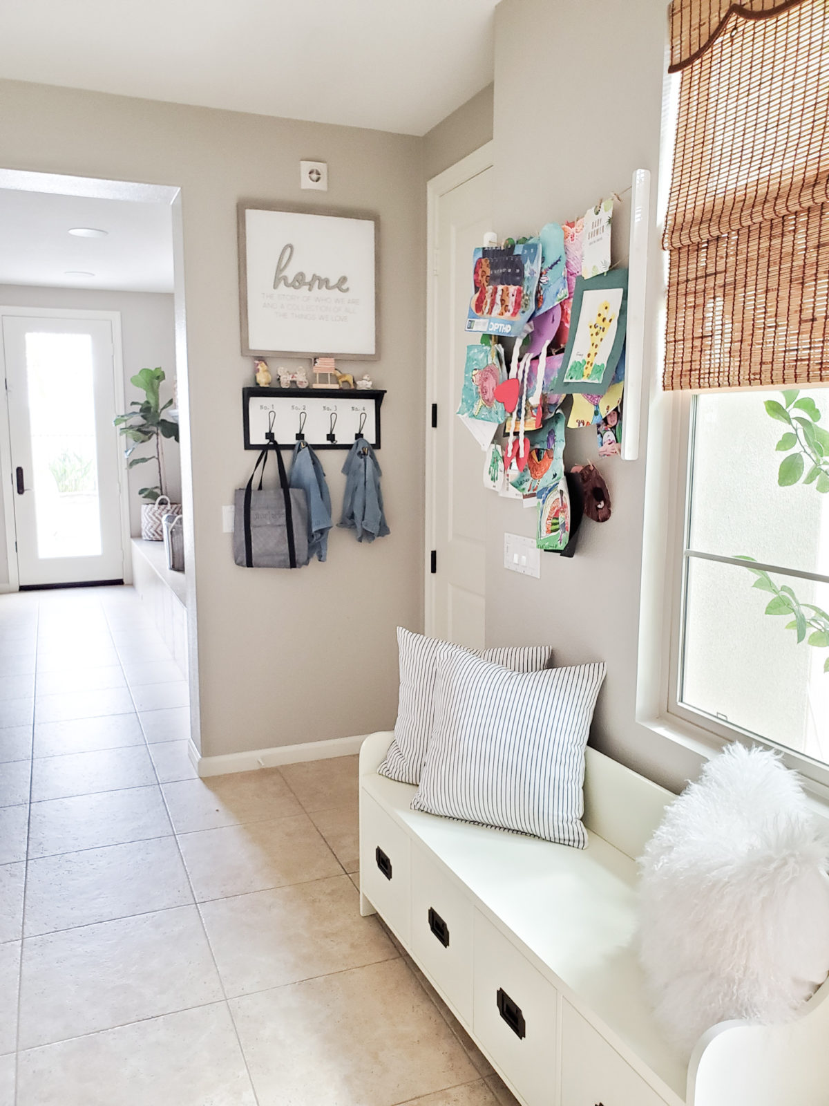
I added a cute coat rack I found at Homegoods and sign that I also found at Homegoods. I wanted the area to function a bit more as a drop zone for jackets, back packs, shoes or whatever!! I also switched up the pillows to freshen up the space a bit. Just by adding the coat rack and sign it just made this space feel more defined. Similar Striped pillow, fur pillow, similar coat rack
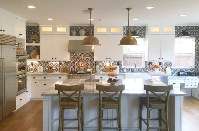
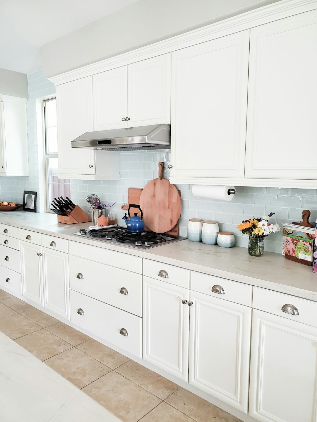 My client has a beautiful kitchen! I just added a few accessories like these oversized charcuterie boards and cute canisters that I found at Homegoods. By just adding a few touches and rearranging some things makes all the difference in the world! Round Charcuterie board, Rectangular Charcuterie board
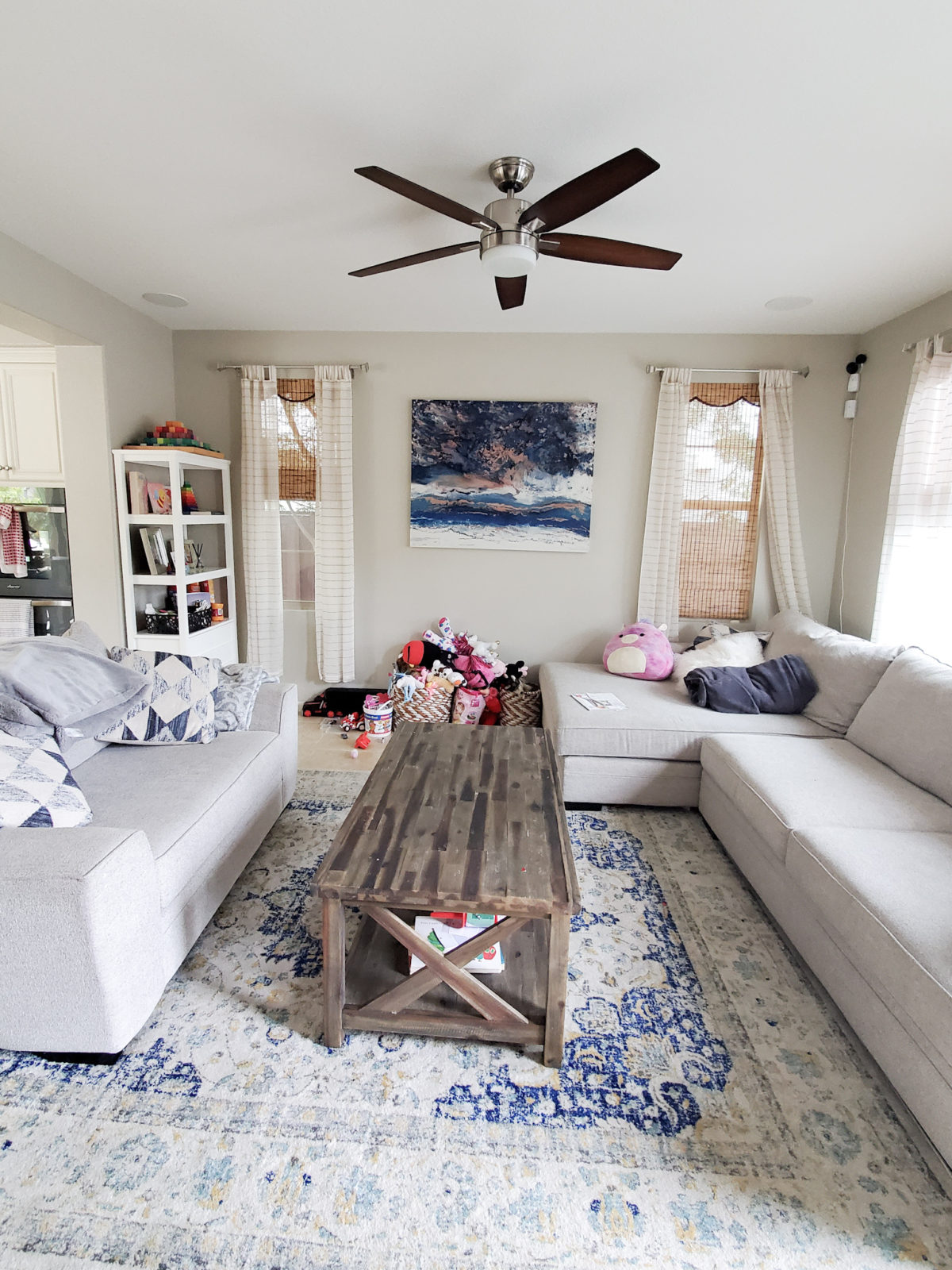
When my client purchased the home, they purchased some of the furniture that the previous owners had, like this sectional and oversized chair. Although they loved the comfiness of the pieces they just knew they were too big for the room. I agreed and we decided we would change out to smaller pieces.
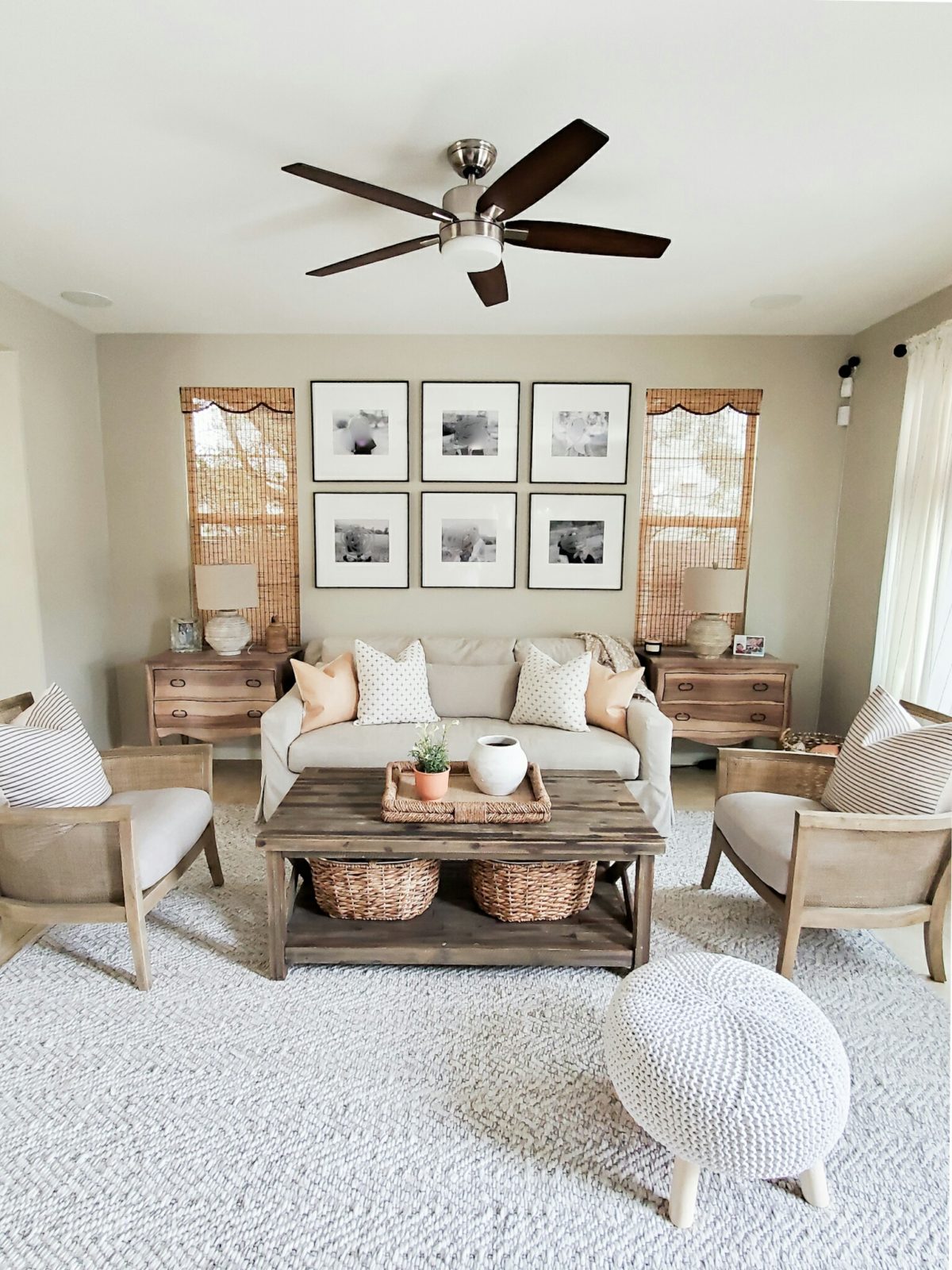
Now these pieces fit the room much better!! We replaced the sectional with this lovely York Sofa from Pottery Barn in the color Pebble in their Performance Heathered Tweed fabric. It’s a nice deep sofa and the bonus is it is slipcovered so you can wash it when needed! We also changed out the rug with a more neutral one, and added two accent chairs. I topped off the chairs with a brown striped pillow cover from Jules and Tone in the 24×24 size. I also added two faux leather pillow covers on the sofa from Jules and Tone as well. My client already had the coffee table and it works perfectly in the space. Similar coffee table, ottoman
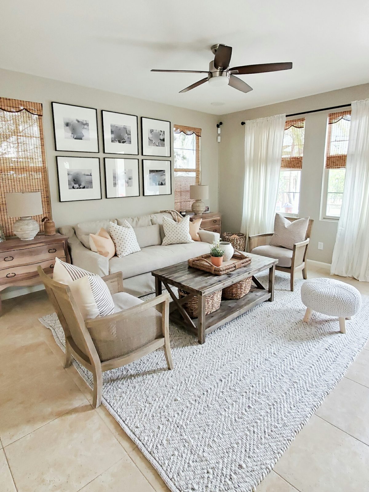
I found these great side tables on Way Day for a great deal! They go perfectly with the sofa and chairs. I found a pair of neutral lamps at Homegoods along with the accessories and baskets. Baskets are the best way to add functional ascetically pleasing storage. You can hide a lot of toys in baskets! I also replaced my client’s previous curtains with these cute black striped ones.
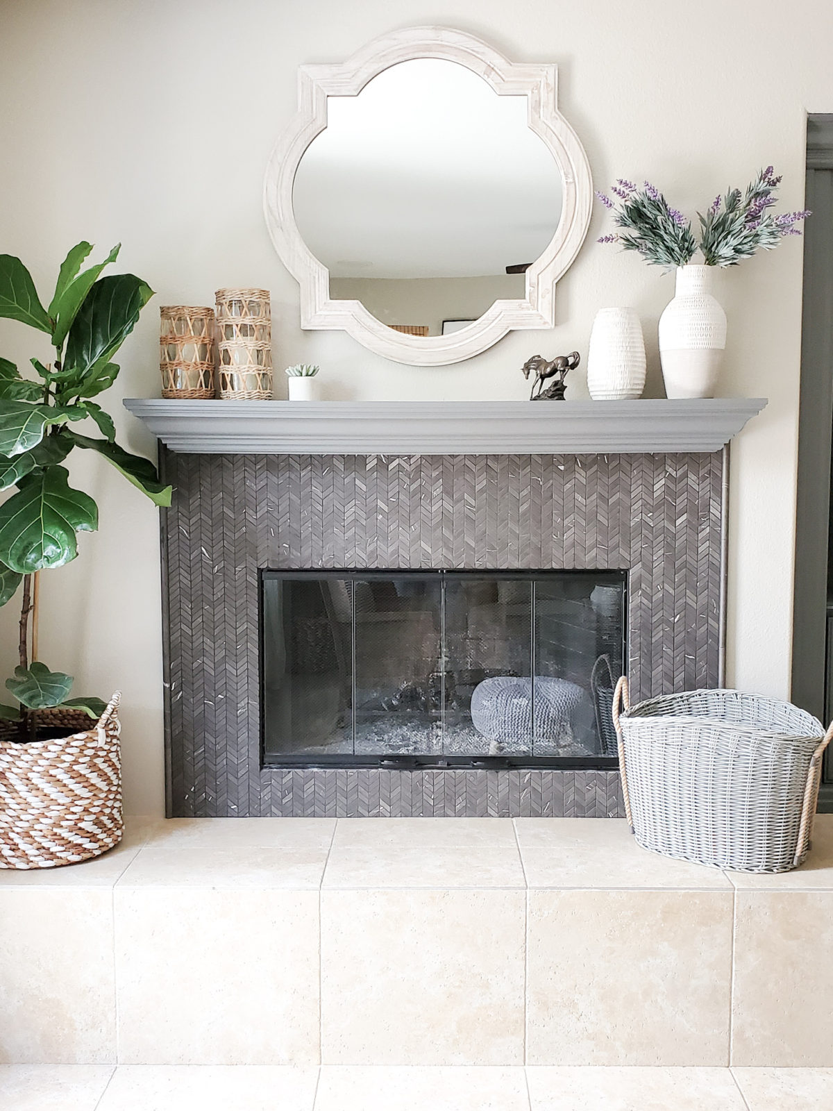
I also refreshed and changed up the fireplace mantle and hearth. I added a wooden mirror. I really like the unique shape and the wood tone worked perfectly with the tile on the hearth and floor. I also added accessories from HomeGoods and pretty gray basket. My client already had this gorgeous fiddle leaf fig. Similar basket, similar candle holder
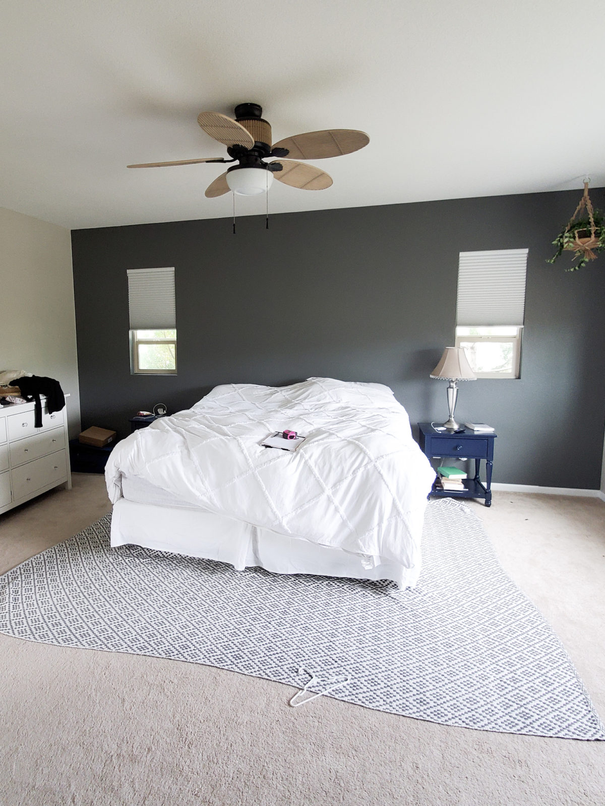
The last space in the home that I helped redesign was the master bedroom. My client wanted to have a more put together space that felt calm and relaxing.
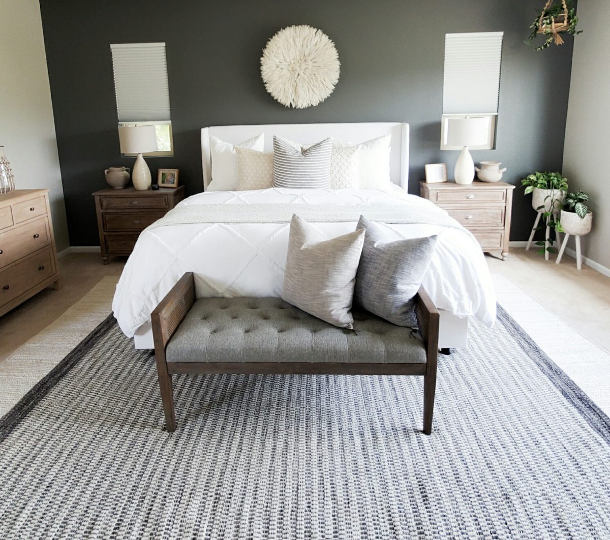
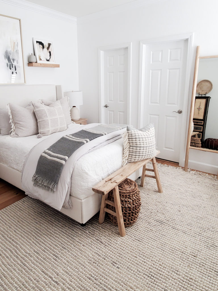
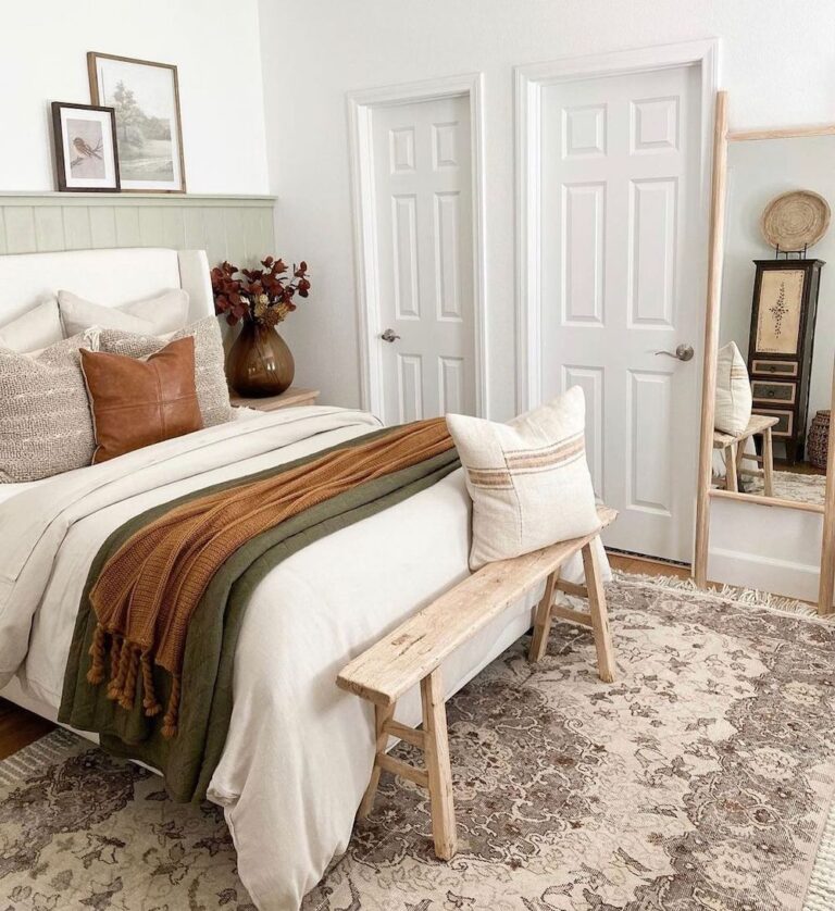
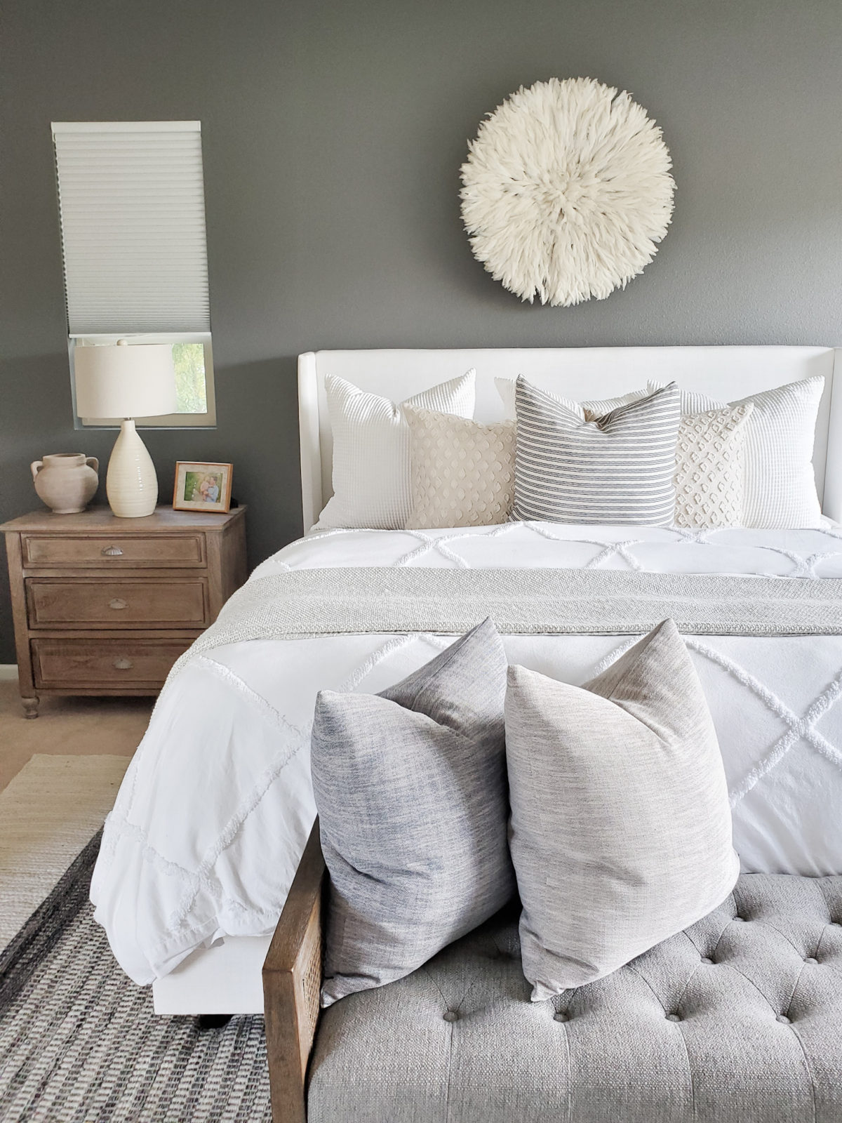
I added a new bed into the room and that alone made a huge difference. I love this bed. I have it in my guest room as well. It is a beautiful neutral color. I also added a bench at the end of the bed for extra seating and I just feel a bench at the end of the bed is necessary. My client already had that pretty white duvet cover. I topped it with my favorite bed blanket, and I found the pillows at Homegoods. I added two good size nightstands which gave my client more storage and helped fill up the space. I topped them with two lamps from Homegoods. My client loves plants so I added these cute planters to help hold them. Accent wall color unknown
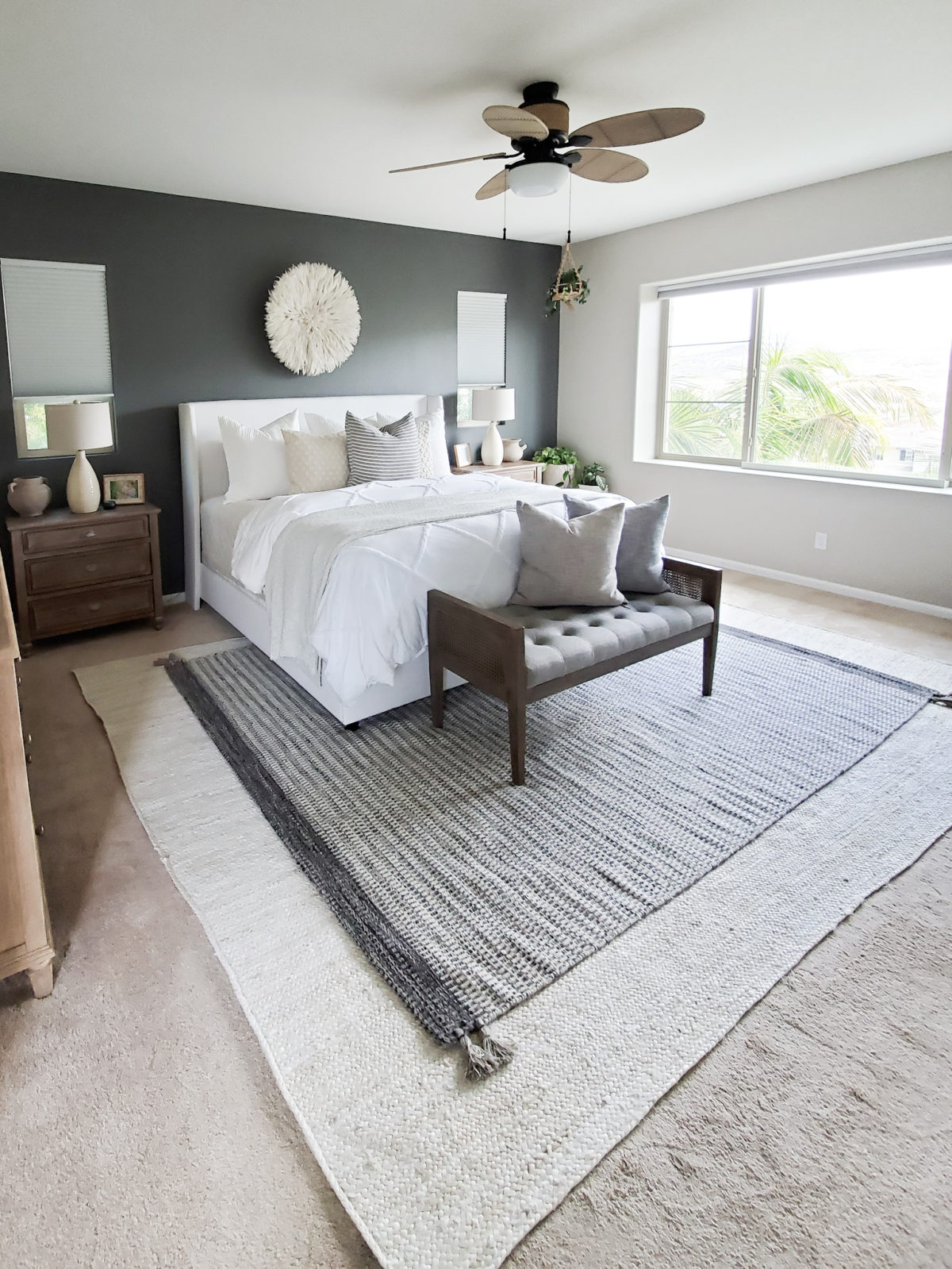
Of course we had to add rugs!! We decided to go with the layered look in here. My client loved the Gray Tassel Rug from Rugs USA and I thought it would go perfectly with the accent wall. So we paired it with this beautiful off white jute rug also from Rugs USA, my go to place for rugs!! Jute rugs make the ideal layering rugs. Plus they add some texture to the space. My client wanted a juju hat above the bed and you know I was on board with that!!! Juju hats always look so good above beds, and it just pops against the dark wall!
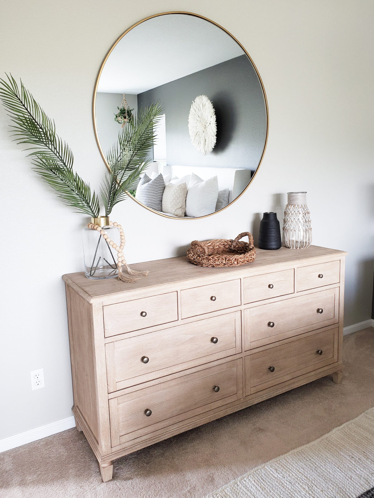
The first inspo picture my client showed me was of a dresser with a large mirror above it. My client wanted to recreate that look in the master bedroom. My client loved the Sausalito dresser from Pottery Barn and wanted a large mirror above it! Of course I was on board with that!! This area turned out better than I could have imagined. I love how the oversized mirror is such a statement piece! It pairs perfectly with the dresser too. I added a few accessories and faux stems and it was the icing on the cake…or dresser! Similar glass vase
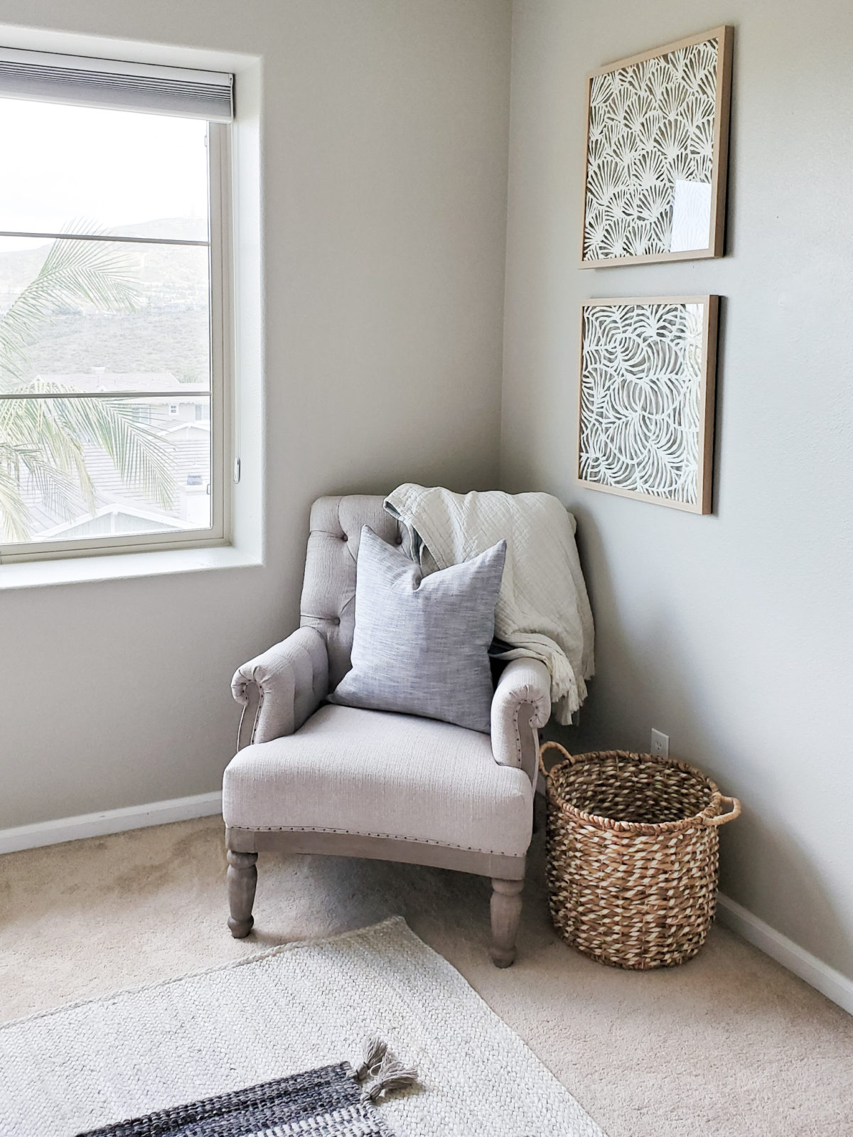
I added a little sitting area in the corner of the bedroom. Originally this area had the television on the wall, but I recommended my client relocate the television to the wall directly in front of the bed. So that gave me the opportunity to add some wall decor on the wall. This beautiful gray rolled arm chair is not only stylish but super comfy! I topped it with a cute throw blanket to finish it off.
Well there you go!! I hope you enjoyed seeing a little more of this client project. It was a very fun project to work on and I am so pleased with how it turned out. The best part is my client loves it!! Thank you for taking the time to read my post and be sure to subscribe so you don’t miss a thing!!

